Lume has a new logo!
by Óscar Otero
2 min read
Lume was born 5 years ago as an excuse to try Deno, the new JavaScript runtime. At that moment, the hype around Deno led to many projects featuring a dinosaur in their logo. Lume joined this trend, making a joke with the concept of fire and Deno.

I've wanted to change the logo for a long time, and finally, I could manage some time to work on that. There are many reasons for this change:
- The Lume logo is based on the original logo of Deno, which has changed twice since then.
- Some people think Lume is a Deno product.
- The logo doesn't work for small sizes.
The vagalume
For the new logo, I wanted to focus on the main concept of Lume: the fire. I didn't want to create yet another logo with a flame. Instead, I still wanted a pet, but a firefly instead of a dinosaur.
Interestingly enough, in Galician, a firefly is called vagalume, which makes sense for a project called Lume.
Logo design
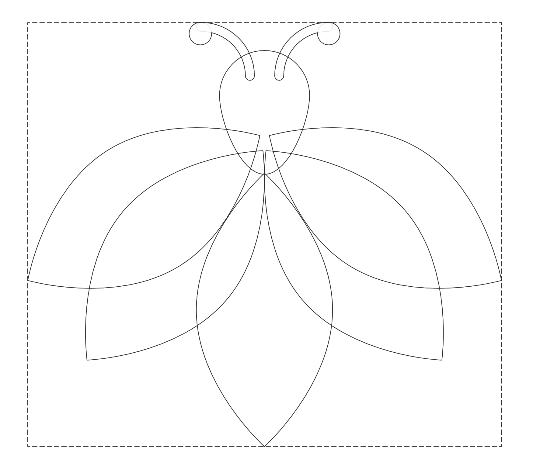
The new logo is more geometric, created with a leaf shape repeated five times, and a head with two antennae. This simple design makes it work better at small sizes.

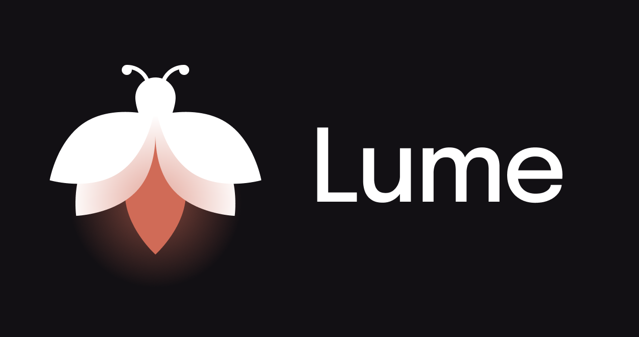
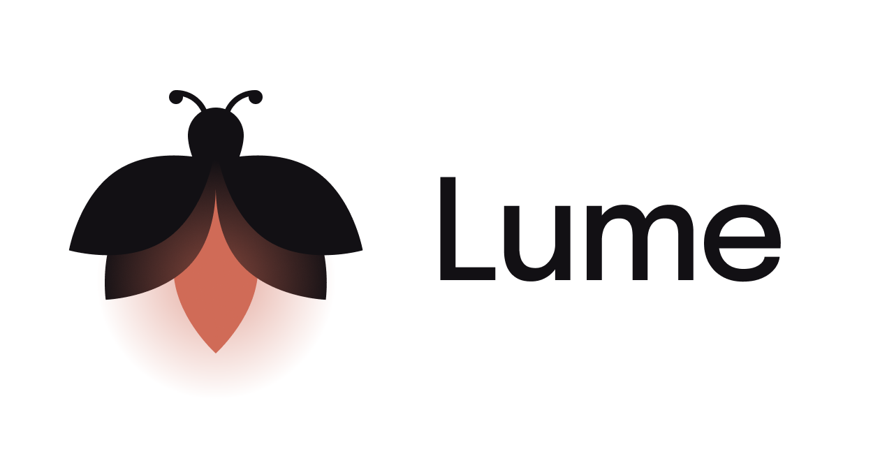
The red color is used to represent the fire that emits light (using a gradient). It also works in dark and light contexts, just inverting the black and white colors:


The font family used didn't change. It's still Epilogue, a beautiful sans-serif font with a great x-height. I only made some kerning tweaks and the name is now "Lume" (with upper case L) instead of "lume".
Thanks to José Luis Antúnez for the feedback and suggestions, and to Studio Ghibli for the film Grave of the Fireflies from which I got some inspiration.